Graph Features
The graphs available in unique, multiple, and virtual sensors share a set of common features for flexible and personalized analysis of consumption data.
Display Settings
Data Granularity
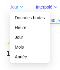
Select the display granularity according to your analysis needs:
- Raw data: displays measurements as they are received from the sensors
- Hour: aggregates data by hour
- Day: aggregates data by day (default view)
- Month: aggregates data by month
- Year: aggregates data by year
Data Processing
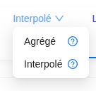
Choose the processing mode for missing data:
- Aggregated: displays only the actually measured data without estimation. When the data returns, all the missing consumption is reported on the day of receipt.
- Interpolated: displays continuous curves but uses estimated values by smoothing the consumption to fill in data gaps.
Display Units
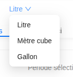
Adjust the display according to your unit preferences:
- Liters (default unit)
- Cubic meters (m³)
- Gallons
Time Navigation
Period Selector
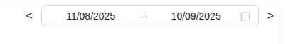
A date range selector allows you to precisely define the period to analyze. Navigation buttons make it easy to switch to previous or next periods.
Predefined Periods

For quick access to common analyses, use the predefined periods:
- 7 days: rolling week
- 30 days: rolling month
- This month: from the 1st to the last day of the current month
- 3 months: rolling quarter
- 6 months: rolling half-year
- This year: from January 1st to December 31st of the current year
- 1 year: rolling year
- 2 years: two-year rolling period
Data Export
A download button allows you to export the displayed data in XLSX (Excel) format for your external analyses, reports, or archiving.
💡 Tip: All these features are synchronized with each other. Changing the granularity or the period automatically updates the graph and the exportable data.
Chart Comments
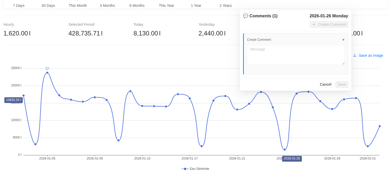
You can annotate data points to explain consumption variations.
- Add a comment: Ctrl / Cmd + click on a point on the curve.
- Edit / Delete: Simple click on the bubble icon above the point.
Note: Each annotation automatically records the author and date for better collaborative tracking.
Alerts Center
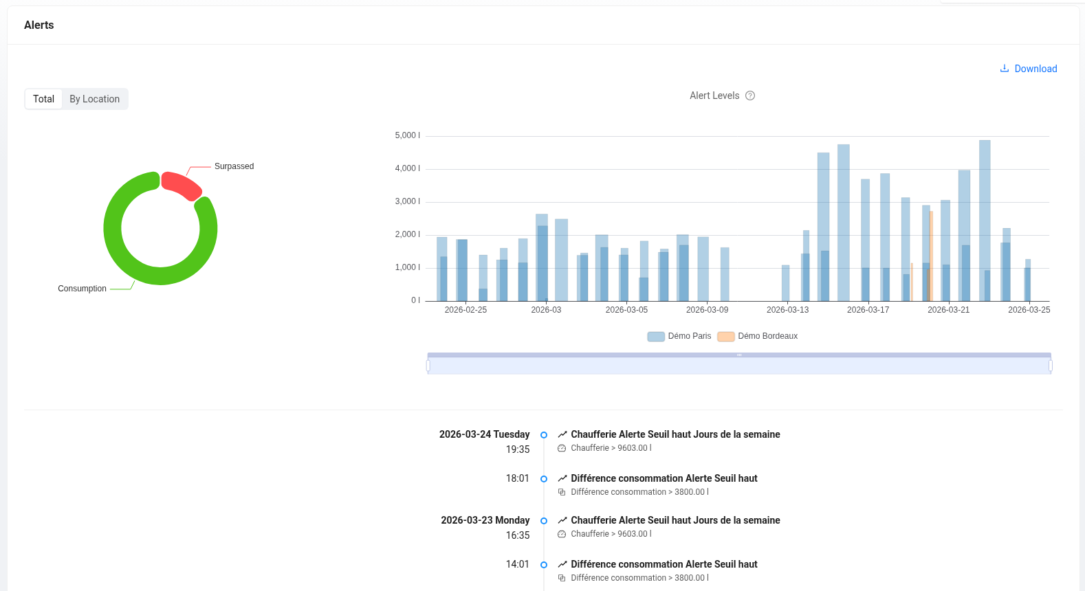
This module centralizes consumption data exceeding configured limits and the real-time event history. It offers a diagnostic interface structured around three axes:
-
Volume Distribution: A chart identifies the most critical sites by isolating their contribution to the total excess volume.
-
Time Analysis: A histogram measures the duration and amplitude of each over-consumption peak. Hovering over a peak displays the precise details of the exceedance (threshold crossed, exact duration, priority).
-
Event Log: Located below the charts, this feed lists detected alerts chronologically. You can follow an alert, mark it as "seen", or add internal comments. Each alert is now qualified according to its flow rate ($l/min$) to assess the urgency of intervention. The system ranks events in four levels: Micro-leak, Low leak, Major leak, or Critical emergency.
The Alerts Center is accessible from the main menu.